y <- select(movielens, movieId, userId, rating) |>
  pivot_wider(names_from = movieId, values_from = rating) |>
  column_to_rownames("userId") |>
  as.matrix()

movie_map <- movielens |> select(movieId, title) |> distinct(movieId, .keep_all = TRUE)

lambda <- 3.1
mu <- mean(y, na.rm = TRUE)
n <- colSums(!is.na(y))
b_i_reg <- colSums(y - mu, na.rm = TRUE) / (n + lambda)
b_u <- rowMeans(sweep(y - mu, 2, b_i_reg), na.rm = TRUE)
r <- sweep(y - mu, 2, b_i_reg) - b_u
colnames(r) <- with(movie_map, title[match(colnames(r), movieId)])30 Matrix factorization
Matrix factorization is a widely used concept in machine learning. It is very much related to factor analysis, singular value decomposition (SVD), and principal component analysis (PCA). Here we describe the concept in the context of movie recommendation systems.
We have described how the model:
\[ Y_{u,i} = \mu + b_i + b_u + \varepsilon_{u,i} \]
accounts for movie to movie differences through the \(b_i\) and user to user differences through the \(b_u\). But this model leaves out an important source of variation related to the fact that groups of movies have similar rating patterns and groups of users have similar rating patterns as well. We will discover these patterns by studying the residuals:
\[ r_{u,i} = y_{u,i} - \hat{b}_i - \hat{b}_u \]
We can compute these residuals for the model we fit in the previous chapter:
If the movie and user effect model explains all the signal, and the \(\varepsilon\) are just noise, then the residuals for different movies should be independent from each other. But they are not. Here are some examples:
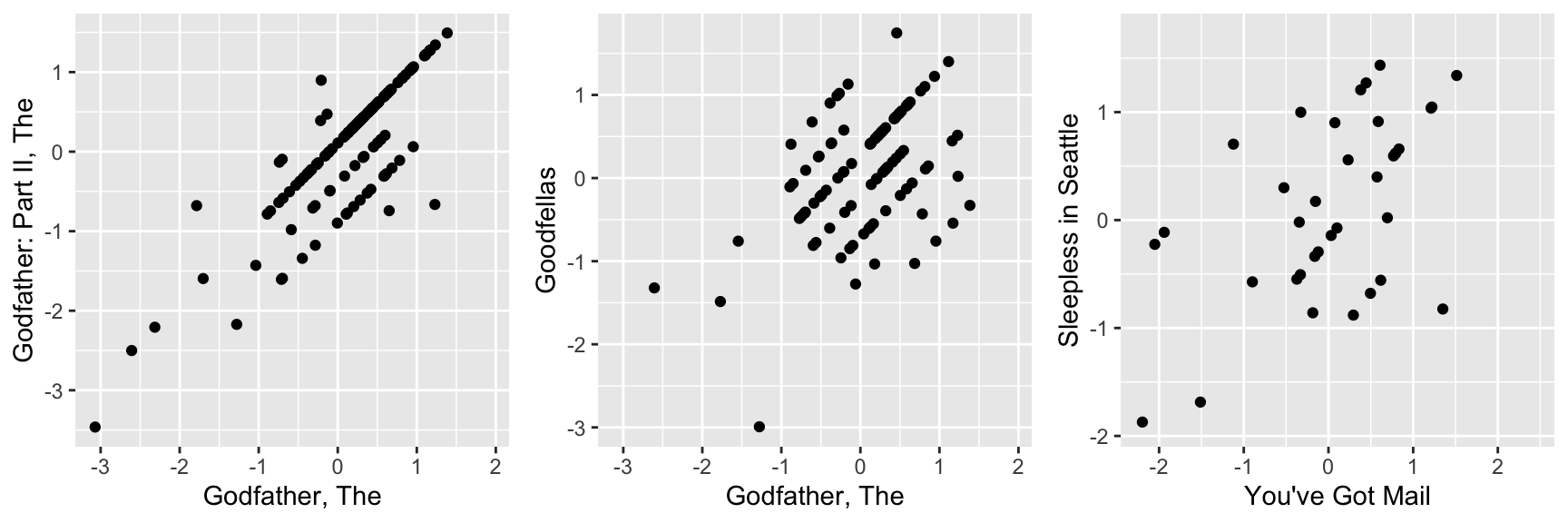
This plot says that users that liked The Godfather more than what the model expects them to, based on the movie and user effects, also liked The Godfather II more than expected. A similar relationship is seen when comparing The Godfather and Goodfellas. Although not as strong, there is still correlation. We see correlations between You’ve Got Mail and Sleepless in Seattle as well
By looking at the correlation between movies, we can see a pattern (we rename the columns to save print space):
            Godfather Godfather2 Goodfellas You've Got  Sleepless
Godfather   1.0000000  0.8326000  0.4583390 -0.3445887 -0.3254261
Godfather2  0.8326000  1.0000000  0.6262675 -0.2971988 -0.3104670
Goodfellas  0.4583390  0.6262675  1.0000000 -0.2969603 -0.3904577
You've Got -0.3445887 -0.2971988 -0.2969603  1.0000000  0.5306141
Sleepless  -0.3254261 -0.3104670 -0.3904577  0.5306141  1.0000000
There seems to be people that like romantic comedies more than expected, while others that like gangster movies more than expected.
These results tell us that there is structure in the data. But how can we model this?
30.1 Factor analysis
Here is an illustration, using a simulation, of how we can use some structure to predict the \(r_{u,i}\). Suppose our residuals r look like this:
round(r, 1) Godfather Godfather2 Goodfellas You've Got Sleepless
1 2.1 2.5 2.4 -1.6 -1.7
2 1.9 1.4 2.0 -1.8 -1.3
3 1.8 2.7 2.3 -2.7 -2.0
4 -0.5 0.7 0.6 -0.8 -0.5
5 -0.6 -0.8 0.6 0.4 0.6
6 -0.1 0.2 0.5 -0.7 0.4
7 -0.3 -0.1 -0.4 -0.4 0.7
8 0.3 0.4 0.3 0.0 0.7
9 -1.4 -2.2 -1.5 2.0 2.8
10 -2.6 -1.5 -1.3 1.6 1.3
11 -1.5 -2.0 -2.2 1.7 2.7
12 -1.5 -1.4 -2.3 2.5 2.0There seems to be a pattern here. In fact, we can see very strong correlation patterns:
cor(r) Godfather Godfather2 Goodfellas You've Got Sleepless
Godfather 1.0000000 0.9227480 0.9112020 -0.8976893 -0.8634538
Godfather2 0.9227480 1.0000000 0.9370237 -0.9498184 -0.9685434
Goodfellas 0.9112020 0.9370237 1.0000000 -0.9489823 -0.9557691
You've Got -0.8976893 -0.9498184 -0.9489823 1.0000000 0.9448660
Sleepless -0.8634538 -0.9685434 -0.9557691 0.9448660 1.0000000We can create vectors q and p, that can explain much of the structure we see. The q would look like this:
t(q) Godfather Godfather2 Goodfellas You've Got Sleepless
[1,] 1 1 1 -1 -1and it narrows down movies to two groups: gangster (coded with 1) and romance (coded with -1). We can also reduce the users to three groups:
t(p) 1 2 3 4 5 6 7 8 9 10 11 12
[1,] 2 2 2 0 0 0 0 0 -2 -2 -2 -2those that like gangster movies and dislike romance movies (coded as 2), those that like romance movies and dislike gangster movies (coded as -2), and those that don’t care (coded as 0). The main point here is that we can almost reconstruct \(r\), which has 60 values, with a couple of vectors totaling 17 values. Note that p and q are equivalent to the patterns and weights we described in Section Section 27.5.
If \(r\) contains the residuals for users \(u=1,\dots,12\) for movies \(i=1,\dots,5\) we can write the following mathematical formula for our residuals \(r_{u,i}\).
\[ r_{u,i} \approx p_u q_i \]
This implies that we can explain more variability by modifying our previous model for movie recommendations to:
\[ Y_{u,i} = \mu + b_i + b_u + p_u q_i + \varepsilon_{u,i} \]
However, we motivated the need for the \(p_u q_i\) term with a simple simulation. The structure found in data is usually more complex. For example, in this first simulation we assumed there were was just one factor \(p_u\) that determined which of the two genres movie \(u\) belongs to. But the structure in our movie data seems to be much more complicated than gangster movie versus romance. We may have many other factors. Here we present a slightly more complex simulation. We now add a sixth movie, Scent of Woman.
round(r, 1) Godfather Godfather2 Goodfellas You've Got Sleepless Scent
1 0.0 0.3 2.2 0.2 0.1 -2.3
2 2.0 1.7 0.0 -1.9 -1.7 0.3
3 1.9 2.4 0.1 -2.3 -2.0 0.0
4 -0.3 0.3 0.3 -0.4 -0.3 0.3
5 -0.3 -0.4 0.3 0.2 0.3 -0.3
6 0.9 1.1 -0.8 -1.3 -0.8 1.2
7 0.9 1.0 -1.2 -1.2 -0.7 0.7
8 1.2 1.2 -0.9 -1.0 -0.6 0.8
9 -0.7 -1.1 -0.8 1.0 1.4 0.7
10 -2.3 -1.8 0.3 1.8 1.7 -0.1
11 -1.7 -2.0 -0.1 1.9 2.3 0.2
12 -1.8 -1.7 -0.1 2.3 2.0 0.4By exploring the correlation structure of this new dataset
            Godfather  Godfather2  Goodfellas        YGM          SS
Godfather   1.0000000  0.97596928 -0.17481747 -0.9729297 -0.95881628
Godfather2  0.9759693  1.00000000 -0.10510523 -0.9863528 -0.99025965
Goodfellas -0.1748175 -0.10510523  1.00000000  0.1798809  0.08007665
YGM        -0.9729297 -0.98635285  0.17988093  1.0000000  0.98675100
SS         -0.9588163 -0.99025965  0.08007665  0.9867510  1.00000000
SW          0.1298518  0.08758531 -0.94263256 -0.1632361 -0.08174489
                    SW
Godfather   0.12985181
Godfather2  0.08758531
Goodfellas -0.94263256
YGM        -0.16323610
SS         -0.08174489
SW          1.00000000
we note that perhaps we need a second factor to account for the fact that some users like Al Pacino, while others dislike him or don’t care. Notice that the overall structure of the correlation obtained from the simulated data is not that far off the real correlation:
            Godfather Godfather2  Goodfellas        YGM         SS          SW
Godfather   1.0000000  0.8326000  0.45833896 -0.3445887 -0.3254261  0.15250174
Godfather2  0.8326000  1.0000000  0.62626754 -0.2971988 -0.3104670  0.21003950
Goodfellas  0.4583390  0.6262675  1.00000000 -0.2969603 -0.3904577 -0.07988783
YGM        -0.3445887 -0.2971988 -0.29696030  1.0000000  0.5306141 -0.21887238
SS         -0.3254261 -0.3104670 -0.39045775  0.5306141  1.0000000 -0.25664758
SW          0.1525017  0.2100395 -0.07988783 -0.2188724 -0.2566476  1.00000000
To explain this more complicated structure, we need two factors. For example something like this:
t(q) Godfather Godfather2 Goodfellas You've Got Sleepless Scent
[1,] 1 1 1 -1 -1 -1
[2,] 1 1 -1 -1 -1 1With the first factor (the first column of q) used to code the gangster versus romance groups and a second factor (the second column of q) to explain the Al Pacino versus no Al Pacino groups. We will also need two sets of coefficients to explain the variability introduced by the \(3\times 3\) types of groups:
t(p) 1 2 3 4 5 6 7 8 9 10 11 12
[1,] 1 1 1 0 0 0 0 0 -1 -1 -1 -1
[2,] -1 1 1 0 0 1 1 1 0 -1 -1 -1The model with two factors has 36 parameters that can be used to explain much of the variability in the 72 ratings:
\[ Y_{u,i} = \mu + b_i + b_u + p_{u,1} q_{1,i} + p_{u,2} q_{2,i} + \varepsilon_{u,i} \]
Note that in an actual data application, we need to fit this model to data. To explain the complex correlation we observe in real data, we usually permit the entries of \(p\) and \(q\) to be continuous values, rather than discrete ones as we used in the simulation. For example, rather than dividing movies into gangster or romance, we define a continuum. Also note that this is not a linear model and to fit it we need to use an algorithm other than the one used by lm to find the parameters that minimize the least squares. The winning algorithms for the Netflix challenge fit a model similar to the above and used regularization to penalize for large values of \(p\) and \(q\), rather than using least squares. Implementing this approach is beyond the scope of this book.
30.2 Exercises
In this exercise set, we will be covering a topic useful for understanding matrix factorization: the singular value decomposition (SVD). SVD is a mathematical result that is widely used in machine learning, both in practice and to understand the mathematical properties of some algorithms. This is a rather advanced topic and to complete this exercise set you will have to be familiar with linear algebra concepts such as matrix multiplication, orthogonal matrices, and diagonal matrices.
The SVD tells us that we can decompose an \(N\times p\) matrix \(Y\) with \(p < N\) as
\[ Y = U D V^{\top} \]
With \(U\) and \(V\) orthogonal of dimensions \(N\times p\) and \(p\times p\), respectively, and \(D\) a \(p \times p\) diagonal matrix with the values of the diagonal decreasing:
\[d_{1,1} \geq d_{2,2} \geq \dots d_{p,p}.\]
In this exercise, we will see one of the ways that this decomposition can be useful. To do this, we will construct a dataset that represents grade scores for 100 students in 24 different subjects. The overall average has been removed so this data represents the percentage point each student received above or below the average test score. So a 0 represents an average grade (C), a 25 is a high grade (A+), and a -25 represents a low grade (F). You can simulate the data like this:
set.seed(1987)
n <- 100
k <- 8
Sigma <- 64  * matrix(c(1, .75, .5, .75, 1, .5, .5, .5, 1), 3, 3)
m <- MASS::mvrnorm(n, rep(0, 3), Sigma)
m <- m[order(rowMeans(m), decreasing = TRUE),]
y <- m %x% matrix(rep(1, k), nrow = 1) +
  matrix(rnorm(matrix(n * k * 3)), n, k * 3)
colnames(y) <- c(paste(rep("Math",k), 1:k, sep="_"),
                 paste(rep("Science",k), 1:k, sep="_"),
                 paste(rep("Arts",k), 1:k, sep="_"))
Our goal is to describe the student performances as succinctly as possible. For example, we want to know if these test results are all just random independent numbers. Are all students just about as good? Does being good in one subject imply you will be good in another? How does the SVD help with all this? We will go step by step to show that with just three relatively small pairs of vectors we can explain much of the variability in this \(100 \times 24\) dataset.
You can visualize the 24 test scores for the 100 students by plotting an image:
my_image <- function(x, zlim = range(x), ...){
  colors = rev(RColorBrewer::brewer.pal(9, "RdBu"))
  cols <- 1:ncol(x)
  rows <- 1:nrow(x)
  image(cols, rows, t(x[rev(rows),,drop=FALSE]), xaxt = "n", yaxt = "n",
        xlab="", ylab="",  col = colors, zlim = zlim, ...)
  abline(h=rows + 0.5, v = cols + 0.5)
  axis(side = 1, cols, colnames(x), las = 2)
}

my_image(y)- How would you describe the data based on this figure?
- The test scores are all independent of each other.
- The students that test well are at the top of the image and there seem to be three groupings by subject.
- The students that are good at math are not good at science.
- The students that are good at math are not good at humanities.
- You can examine the correlation between the test scores directly like this:
my_image(cor(y), zlim = c(-1,1))
range(cor(y))
axis(side = 2, 1:ncol(y), rev(colnames(y)), las = 2)
Which of the following best describes what you see?
- The test scores are independent.
- Math and science are highly correlated but the humanities are not.
- There is high correlation between tests in the same subject but no correlation across subjects.
- There is a correlation among all tests, but higher if the tests are in science and math and even higher within each subject.