Association Not Causation
2025-11-12
Association is not causation
Association is not causation is perhaps the most important lesson one can learn in a statistics class.
Correlation is not causation is another way to say this.
Throughout the statistics part of the book, we have described tools useful for quantifying associations between variables.
However, we must be careful not to over-interpret these associations.
Minimal requirements
Empirical association (i.e. Correlation): A relationship must exist between the cause and effect
Temporal priority: The cause must happen before the effect. This is considered the most widely accepted requirement for a causal relationship.
There is a dose-response relationship: increasing the “dose” of the cause increases the effect.
Plausibility: There is a plausible mechanism that explains how the cause leads to the effect.
Exploration and Elimination of alternative causes: Find confounders and understand their role.
Association is not causation
There are many reasons that a variable \(X\) can be correlated with a variable \(Y\), without having any direct effect on \(Y\).
Today we describe four: spurious correlation, data dredging, reverse causation, and confounders.
With reverse causation the correlation is real, it is just not causal
Spurious correlation
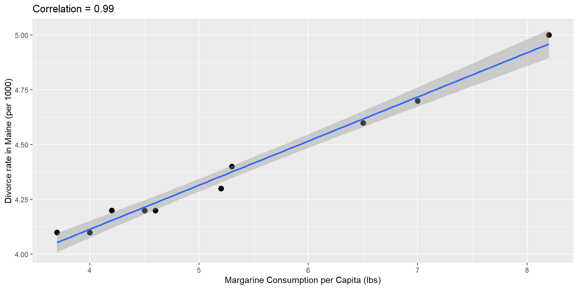
Spurious Associations
- any two things that change in a monotone fashion over time will be correlated
- this can also be caused, as we will see by confounding (where time is often an unadjusted confounder)
- if you look at enough tests, one will be positive (data dredging)
- you should always ask: “How many tests did you do?”
- use of the False Discovery Rate (FDR) and other tools reduces this issue
- outlying observations can cause high correlation
- outliers are often spurious but not always
Spurious correlation
Spurious correlation
# A tibble: 1,000,000 × 2
    group     r
    <int> <dbl>
 1 487822 0.809
 2 312927 0.799
 3 458790 0.785
 4 824422 0.781
 5 160316 0.772
 6 658446 0.767
 7 646127 0.761
 8 444083 0.758
 9 242805 0.757
10 898776 0.754
# ℹ 999,990 more rows- We see a maximum correlation of 0.809.
Spurious correlation
Spurious correlation
Spurious correlation
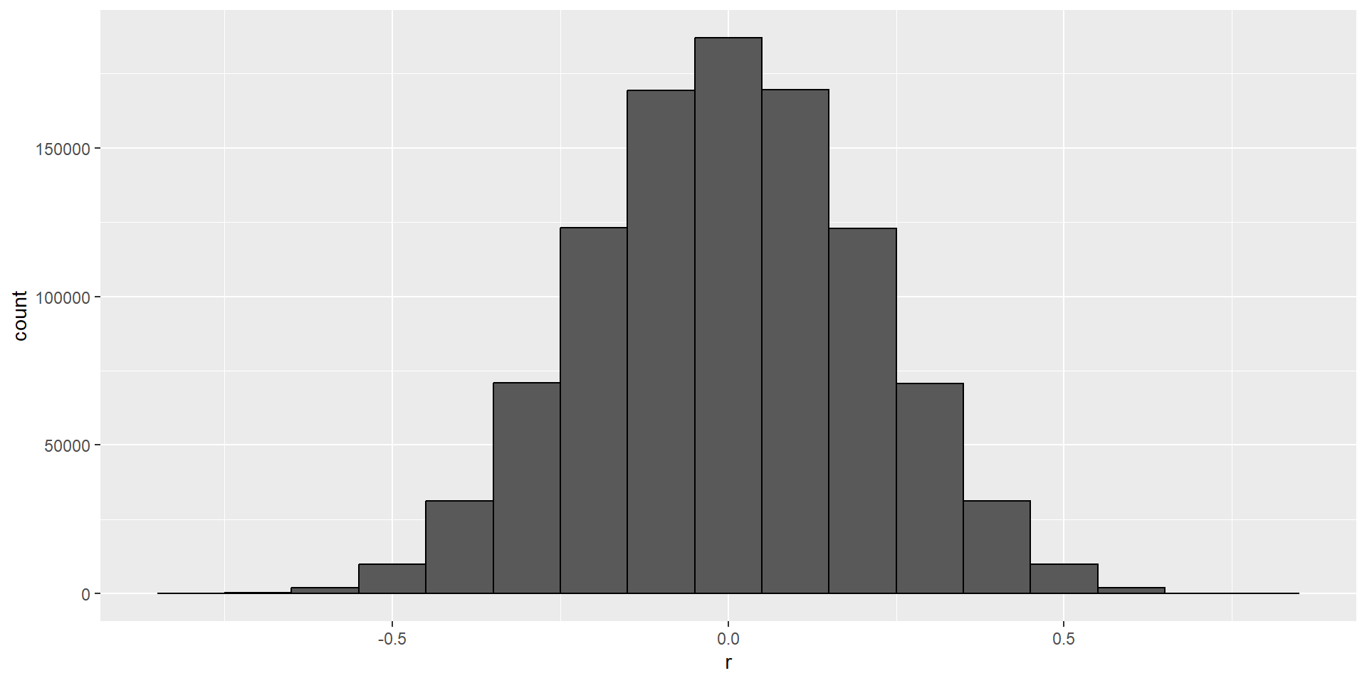
- Sample correlation is a random variable:
Spurious correlation
- It’s simply a mathematical fact that if we observe random correlations that are expected to be 0, but have a standard error of 0.204, then the largest one will be close to 1.
Spurious correlation
Spurious correlation
This particular form of data dredging is referred to as p-hacking.
P-hacking is a topic of much discussion because it poses a problem in scientific publications.
Since publishers tend to reward statistically significant results over negative results, there is an incentive to report significant results.
Spurious correlation
In epidemiology and the social sciences, for example, researchers may look for associations between an adverse outcome and several exposures, and report only the one exposure that resulted in a small p-value.
Similarly with high throughput biology it is routine to test 100’s to 1000’s of genes, genetic variants, epigenetic sites
unless care is taken to perform some form of p-value adjustment these results are unlikely to replicate
Spurious correlation
- Furthermore, they might try fitting several different models to account for confounding and choose the one that yields the smallest p-value.
Spurious correlation
- In experimental disciplines, an experiment might be repeated more than once, yet only the results of the one experiment with a small p-value reported.
Spurious correlation
This does not necessarily happen due to unethical behavior, but rather as a result of statistical ignorance or wishful thinking.
In advanced statistics courses, you can learn methods to adjust for these multiple comparisons.
Outliers
Outliers
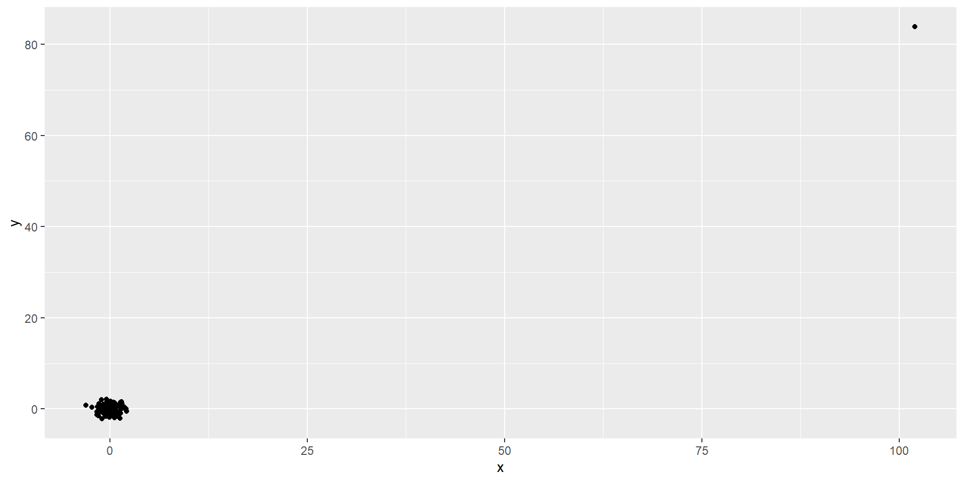
Outliers
This high correlation is driven by the one outlier.
Outliers
- If we remove this outlier, the correlation is greatly reduced to almost 0:
Reversing cause and effect
Another way association is confused with causation is when the cause and effect are reversed.
An example of this is claiming that tutoring makes students perform worse because they test lower than peers that are not tutored.
In this case, the tutoring is not causing the low test scores, but the other way around.
Reversing cause and effect
Quote from NY Times:
When we examined whether regular help with homework had a positive impact on children’s academic performance, we were quite startled by what we found. Regardless of a family’s social class, racial or ethnic background, or a child’s grade level, consistent homework help almost never improved test scores or grades…
- A more likely possibility is that the children needing regular parental help, receive this help because they don’t perform well in school.
Reversing cause and effect
- If we fit the model:
\[ X_i = \beta_0 + \beta_1 y_i + \varepsilon_i, i=1, \dots, N \]
- where \(X_i\) is the father height and \(y_i\) is the son height, we do get a statistically significant result.
Reversing cause and effect
The model fits the data very well.
The model is technically correct.
The estimates and p-values were obtained correctly as well.
But we cannot interpret this as saying that the heights of the son’s has any causal effect on the height of the fathers
Confounders
Confounders are a common reason for associations being misinterpreted.
When studying the relationship between and exposure and an outcome a confounder is third variable that:
Is related to the exposure
Affects the outcome, and is not caused by the exposure
hence the confounder can affect the perceived relationship between the exposure and the outcome.
Confounders
Earlier, when studying baseball data, we saw how Home Runs were a confounder that resulted in a higher correlation than expected when studying the relationship between Bases on Balls and Runs.
In some cases, we can use linear models to account for confounders.
However, this is not always the case.
Confounders
Incorrect interpretation due to confounders is ubiquitous in the lay press and they are often hard to detect.
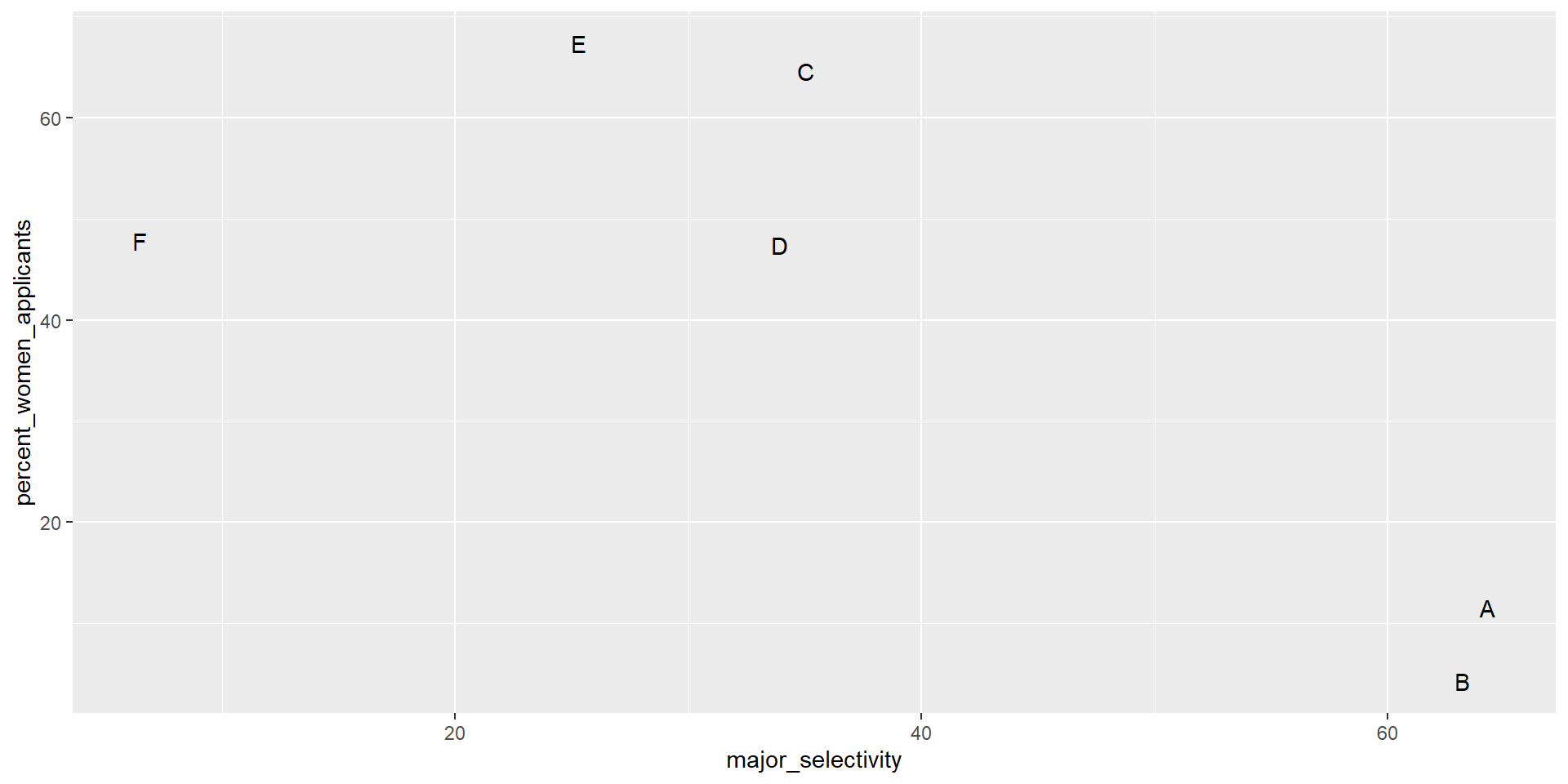
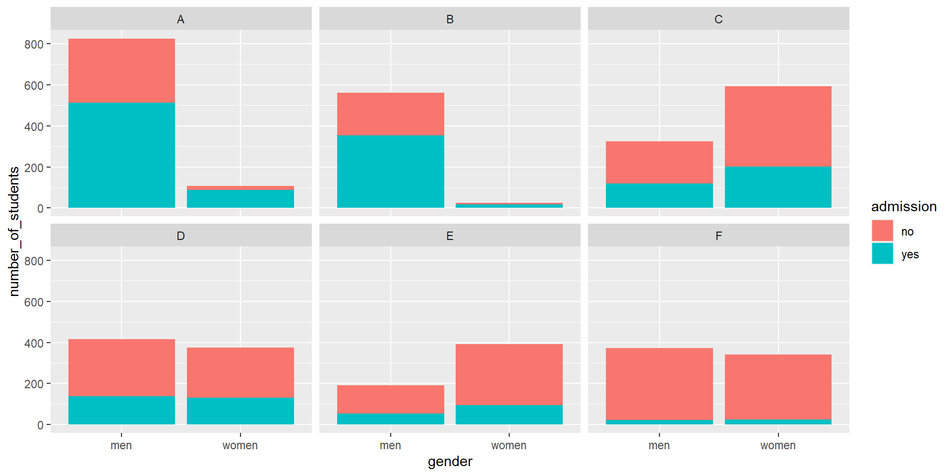
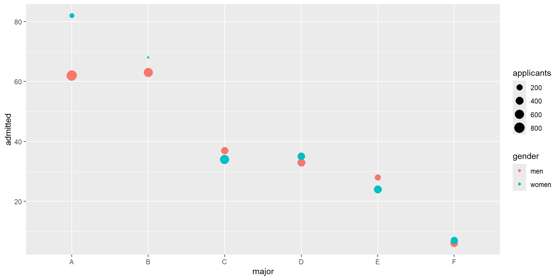
Here, we present a widely used example related to college admissions.
UC Berkeley admissions
two_by_two <- admissions |> group_by(gender) |>
  summarize(total_admitted = round(sum(admitted / 100 * applicants)),
            not_admitted = sum(applicants) - sum(total_admitted))
two_by_two |>
  mutate(percent = total_admitted/(total_admitted + not_admitted)*100)
# A tibble: 2 × 4
gender total_admitted not_admitted percent
<chr> <dbl> <dbl> <dbl>
1 men 1198 1493 44.5
2 women 557 1278 30.4UC Berkeley admissions
- Closer inspection shows a paradoxical result:
UC Berkeley admissions
What’s going on?
This actually can happen if an uncounted confounder is driving most of the variability.
This particular version is called Simpson’s Paradox
UC Berkeley admissions
Confounding explained
Average after stratifying
Average after stratifying
- If we average the difference by major, we find that the percent is actually 3.5% higher for women.
Simpson’s paradox
The case we have just covered is an example of Simpson’s paradox.
It is called a paradox because we see the sign of the correlation flip when comparing the entire population to specific strata.
Simpson’s paradox
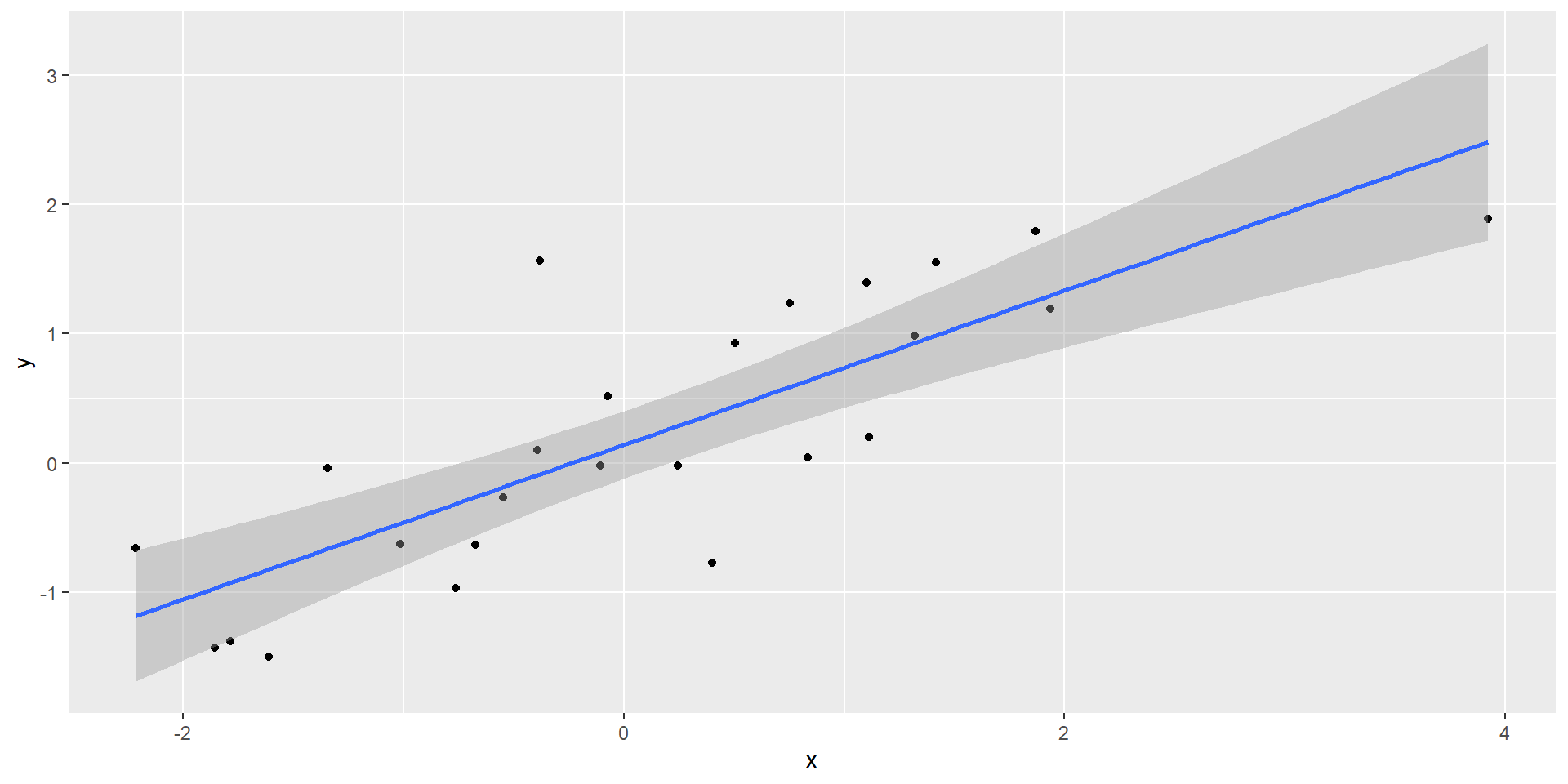
- Simulated \(X\), \(Y\), and \(Z\):
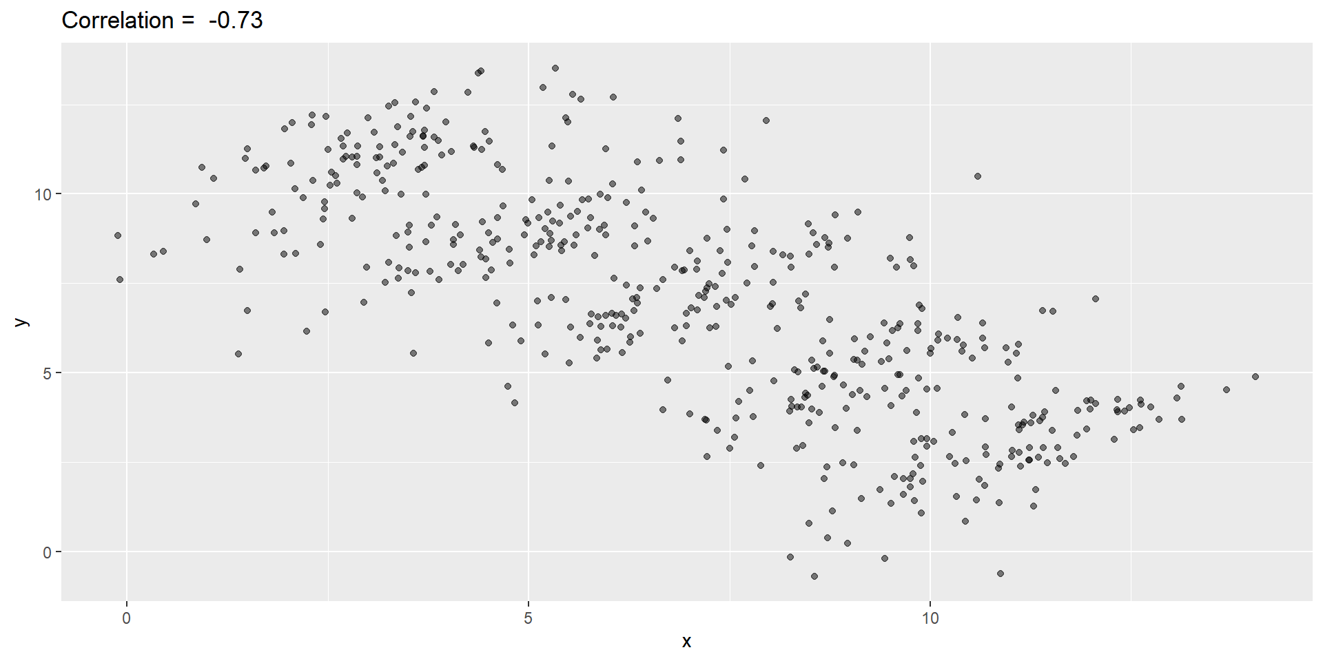
Simpson’s paradox
You can see that \(X\) and \(Y\) are negatively correlated.
However, once we stratify by \(Z\) (shown in different colors below), another pattern emerges.
Simpson’s paradox

Simpson’s paradox
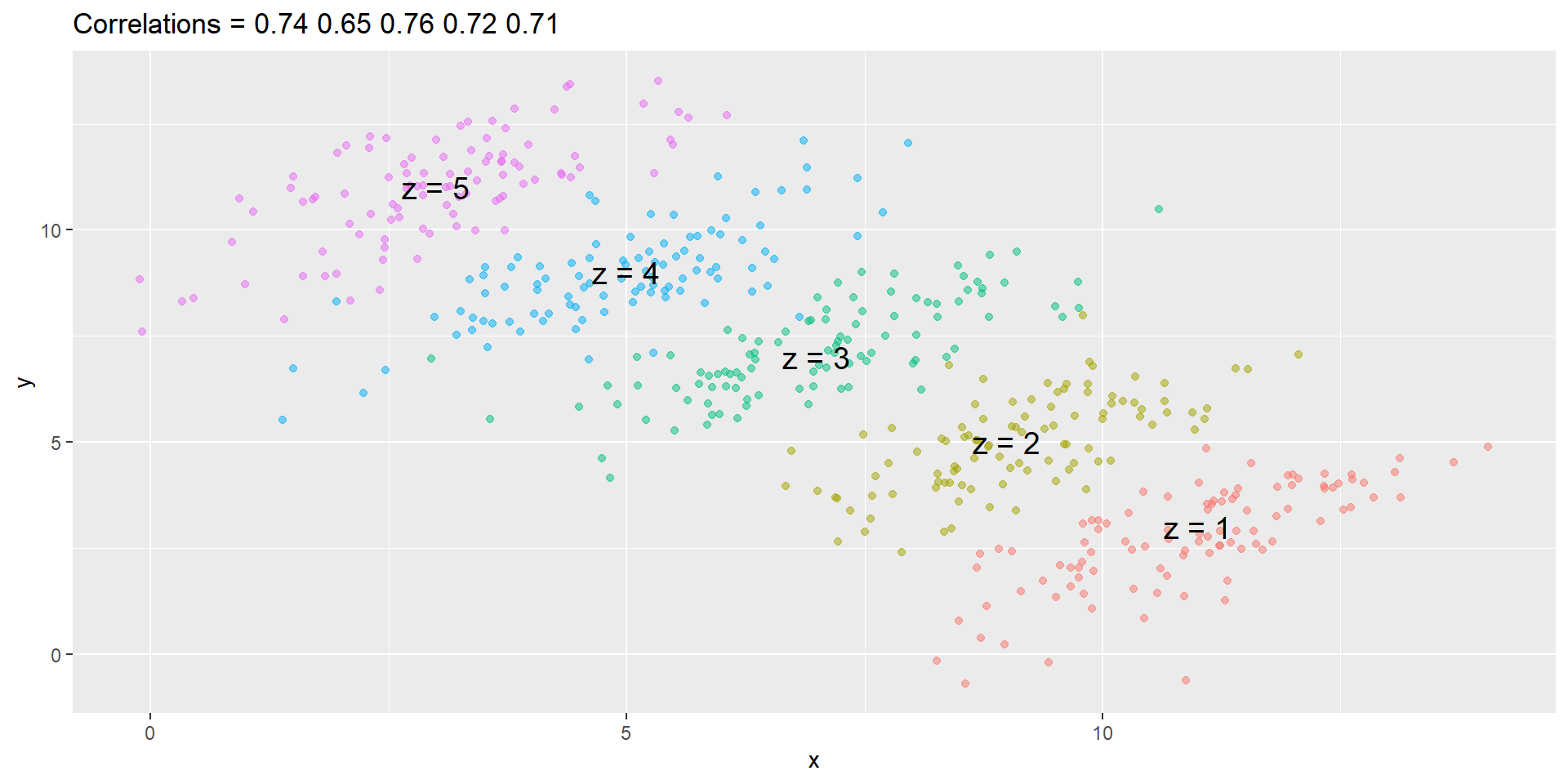
Simpson’s paradox
It is really \(Z\) that is negatively correlated with \(X\).
If we stratify by \(Z\), the \(X\) and \(Y\) are actually positively correlated, as seen in the plot above.
Collider Bias
when studying medical records an interesting phenomenon called collider bias can occur
Example from Wikipedia: https://en.wikipedia.org/wiki/Berkson%27s_paradox
An example presented by mathematician Jordan Ellenberg is that of a dating pool, measured on axes of niceness and handsomeness. A person might conclude from their own dating experience that “the handsome ones tend not to be nice, and the nice ones tend not to be handsome”.
Collider Bias Example
Alice decides to only date men that that are above some line of handsomeness and niceness
But as a result the really handsome ones do not have to be that nice and the really nice ones do not need to be that handsome
so now Alice notices a correlation in her dating pool even when there is no such correlation in the population
Medically relevant examples
studies of hospital records can come to the wrong conclusions
being in hospital requires that the person have something serious and medically adverse
unless care is taken spurious negative associations can be found
when looking at everyone in the hospital for appendicitis the researchers find that few if any of them have kidney disease
Medical Example
and when comparing their appendicitis patients to controls, taken from patients in the hospital they find this association to be significant
it would be wrong to believe that this suggests that kidney disease is protective against appendicitis
they have to have something wrong with them, and since both kidney disease and appendicitis are rare it is very unlikely that many patients will have both