     sex height
1   Male     75
2   Male     70
3   Male     68
4   Male     74
5   Male     61
6 Female 65Distributions
2024-10-09
Distributions
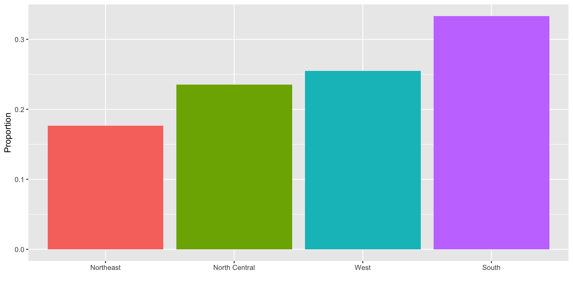
To visualize this we simply use a barplot.
Here is an example with US state regions:
Histograms
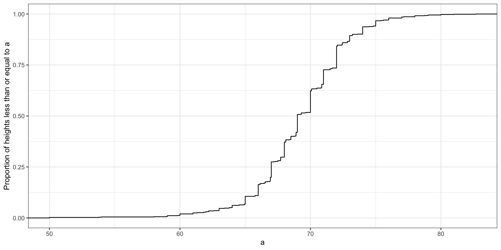
- Here is the eCDF for male student heights:
Histograms
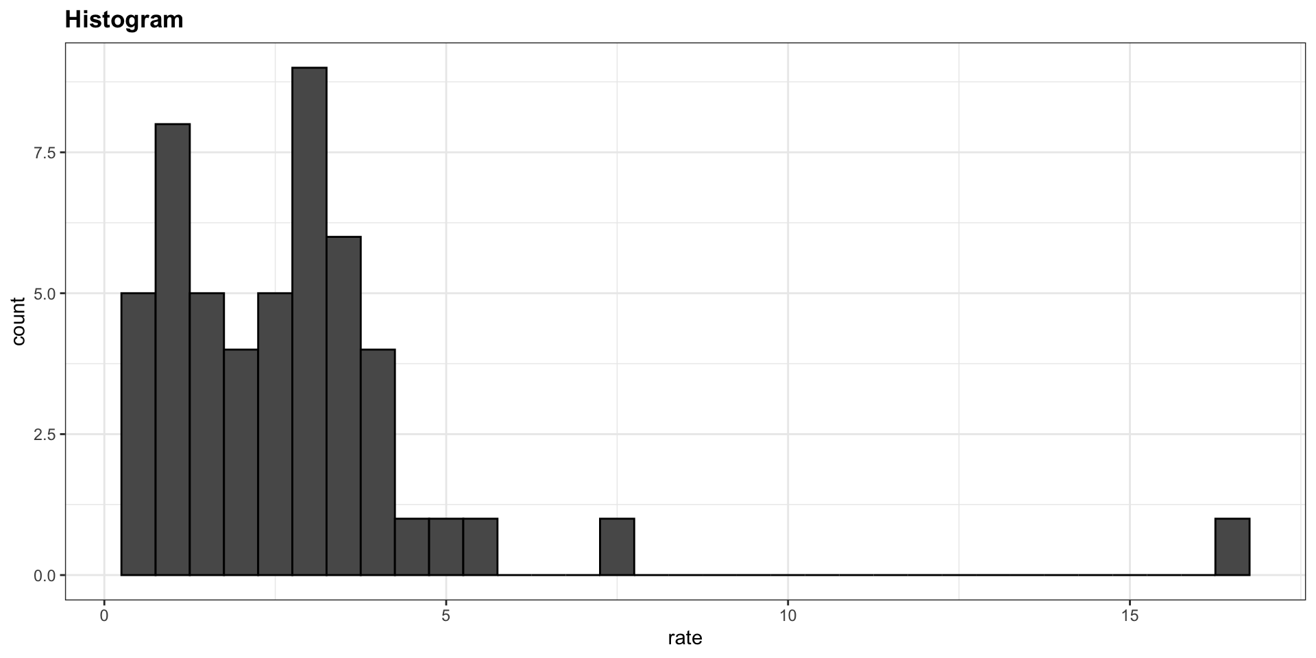
Here is the histogram for the height data splitting the range of values into one inch intervals: \((49.5, 50.5]\), \((50.5, 51.5]\), \((51.5,52.5]\), \((52.5,53.5]\), \(...\), \((82.5,83.5]\).
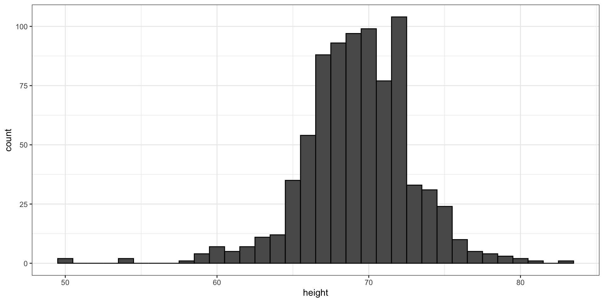
- From this plot one immediately learn some important properties about our data.
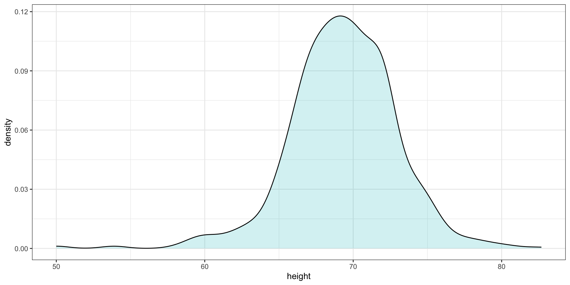
Smoothed density
- Smooth density plots relay the same information as a histogram but are aesthetically more appealing:
Smoothed density
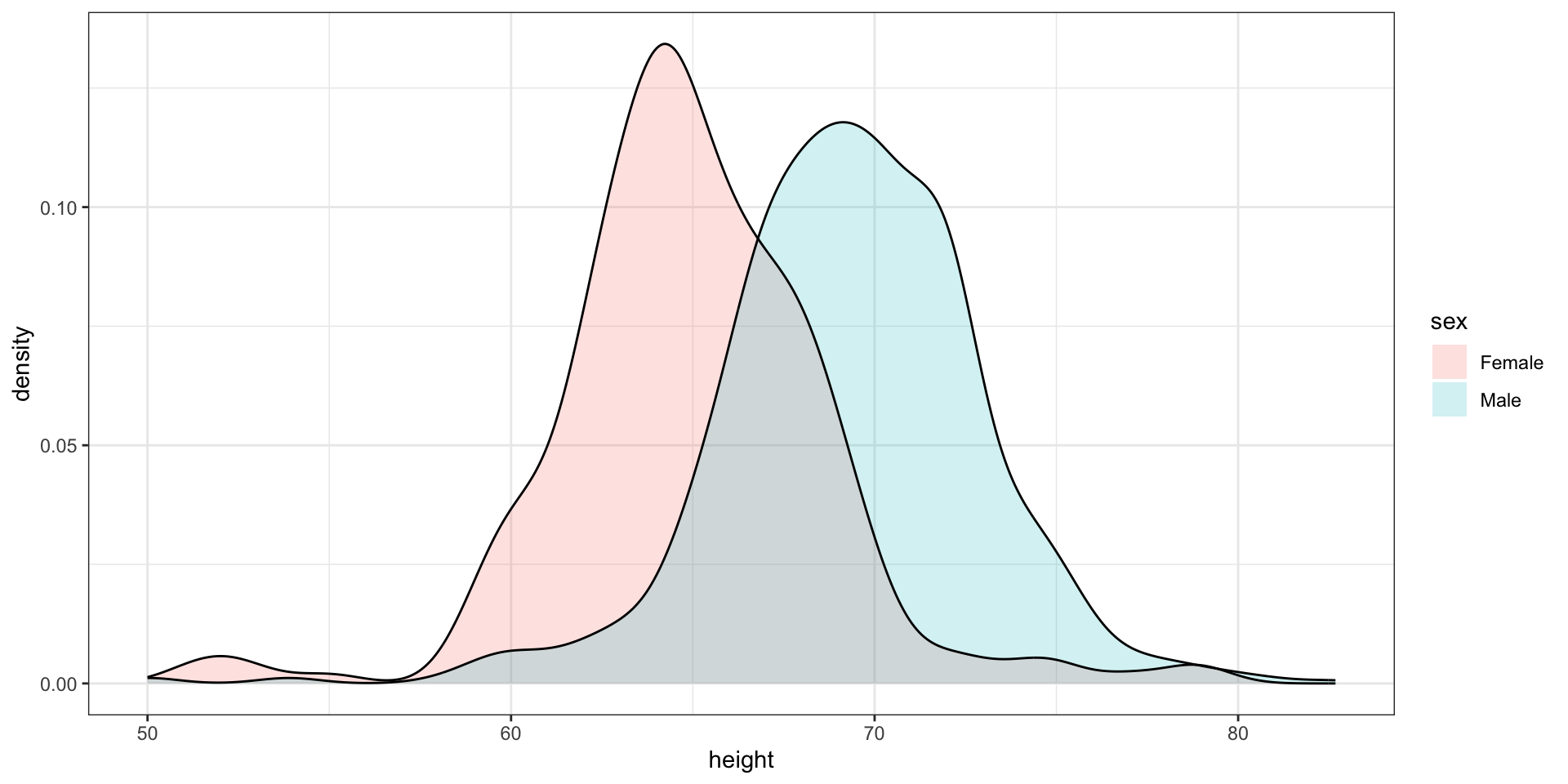
- Here is an example comparing male and female heights:
The normal distribution
- The normal distribution, also known as the bell curve and as the Gaussian distribution.

The normal distribution
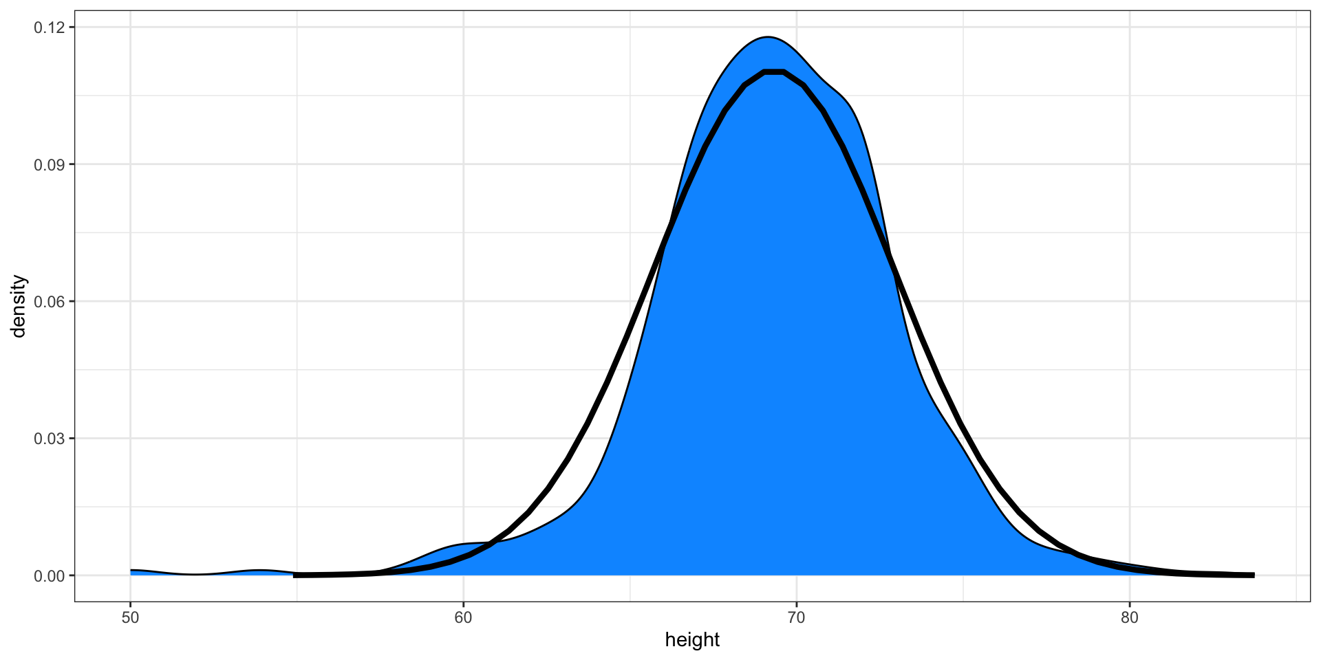
- Here is a plot of our male student height smooth density (blue) and the normal distribution (black) with mean = 69.3 and SD = 3.6:
Boxplot
- Suppose we want to summarize the murder rate distribution.
Boxplots
The boxplot sumarizes with a box with whiskers:
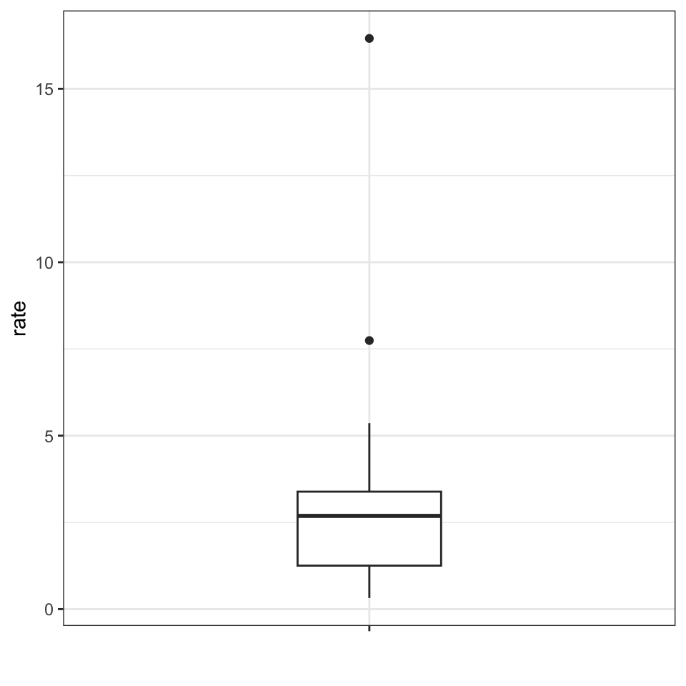
From just this simple plot, we know that:
- the median is about 2.5,
- that the distribution is not symmetric, and that
- the range is 0 to 5 for the great majority of states with two exceptions.
Case study continued
Here are the heights for men and women:
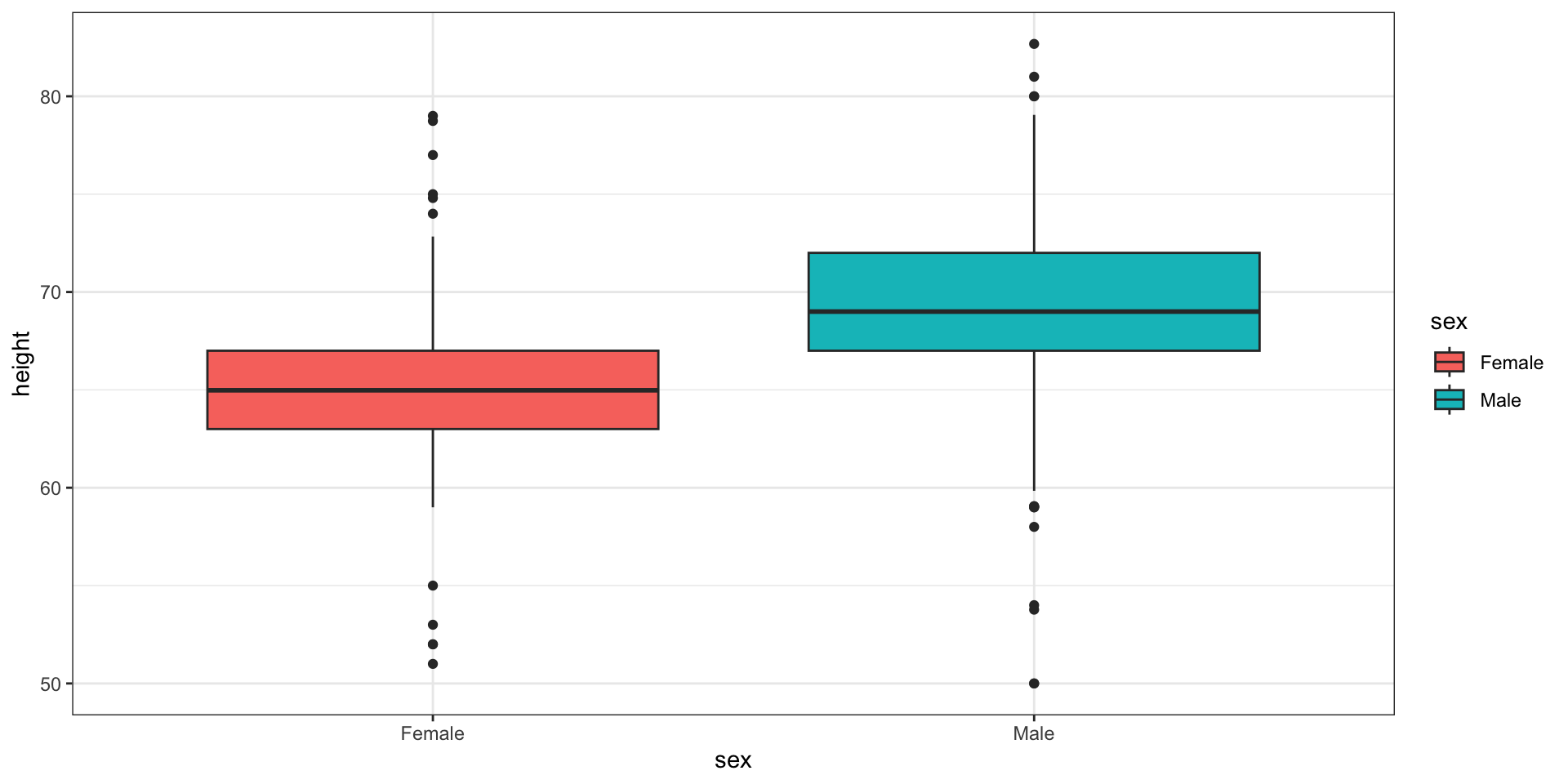
Case study continued
The plot immediately reveals that males are, on average, taller than females.
However, exploratory plots reveal that the approximation is not as useful:
