ggplot2
2024-09-23
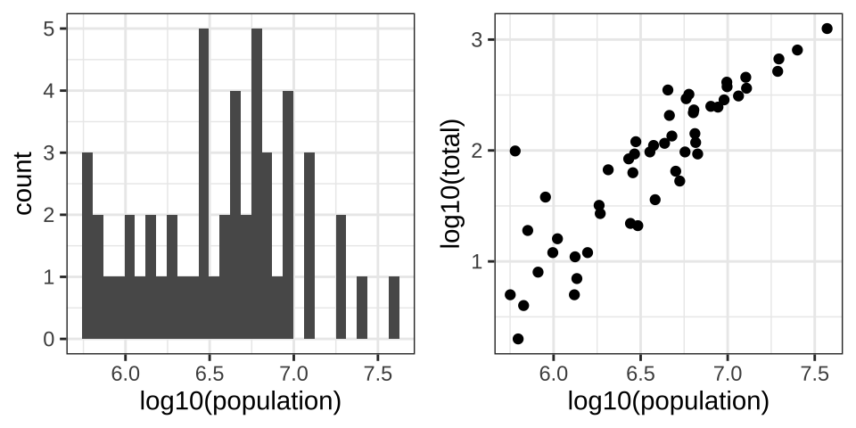
The components of a graph
In today’s lecture we recreate this:

ggplot objects
To see the plot we can print it:

Aesthetic mappings
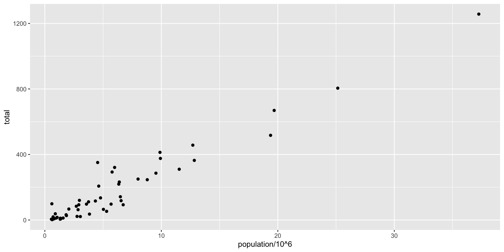
To make a scatter plot we use
geom_points.The help file tells us this is how we use it:
Aesthetic mappings
- Since we defined
pearlier, we can add a layer like this:

- Note we are no longer using
x=andy =.
Layers
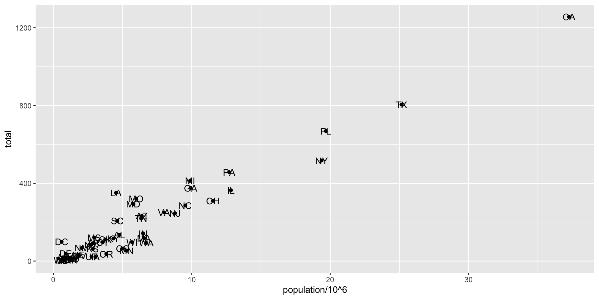
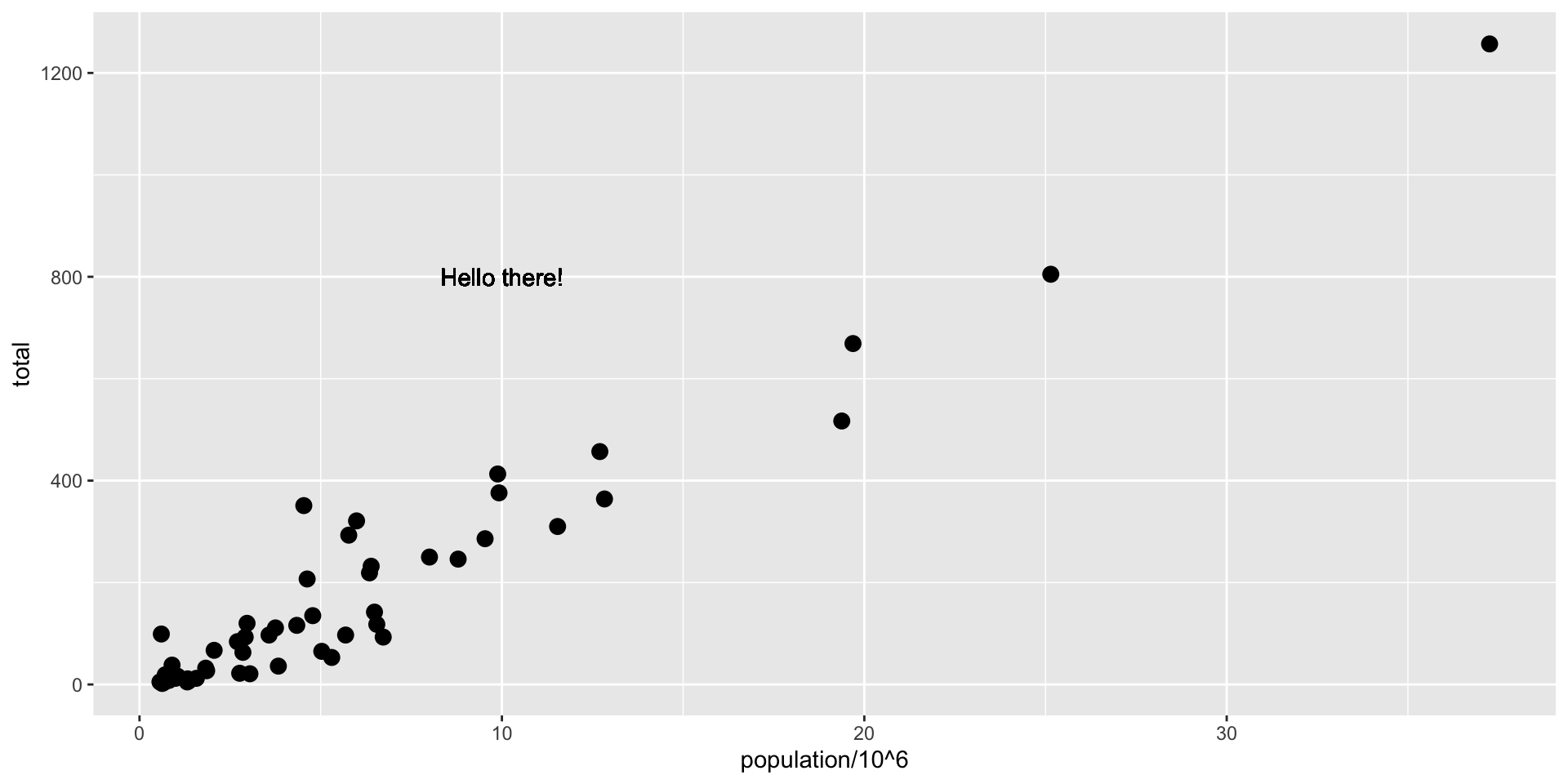
- To add text we use
geom_text:
Tinkering with arguments
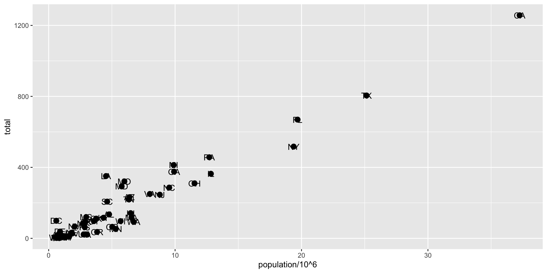
sizecan be an aesthetic mapping, but here it is not, so all points get bigger.
Tinkering with arguments

nudge_xis not an aesthetic mapping.
Global versus local mappings
- All the layers will assume the global mapping unless we explicitly define another one.

- The two layers use the global mapping.
Global versus local mappings
- We can override the global
aesby defining one in the geometry functions:
Scales
- Layers can define transformations:

Labels and titles
- There are layers for adding labels and titles:

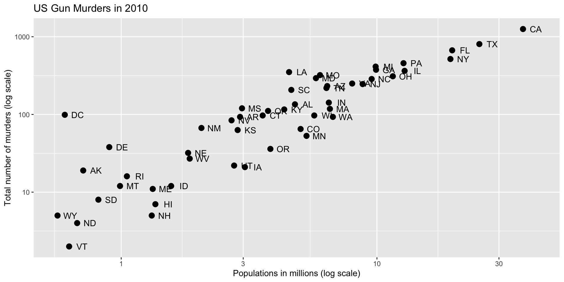
Almost there
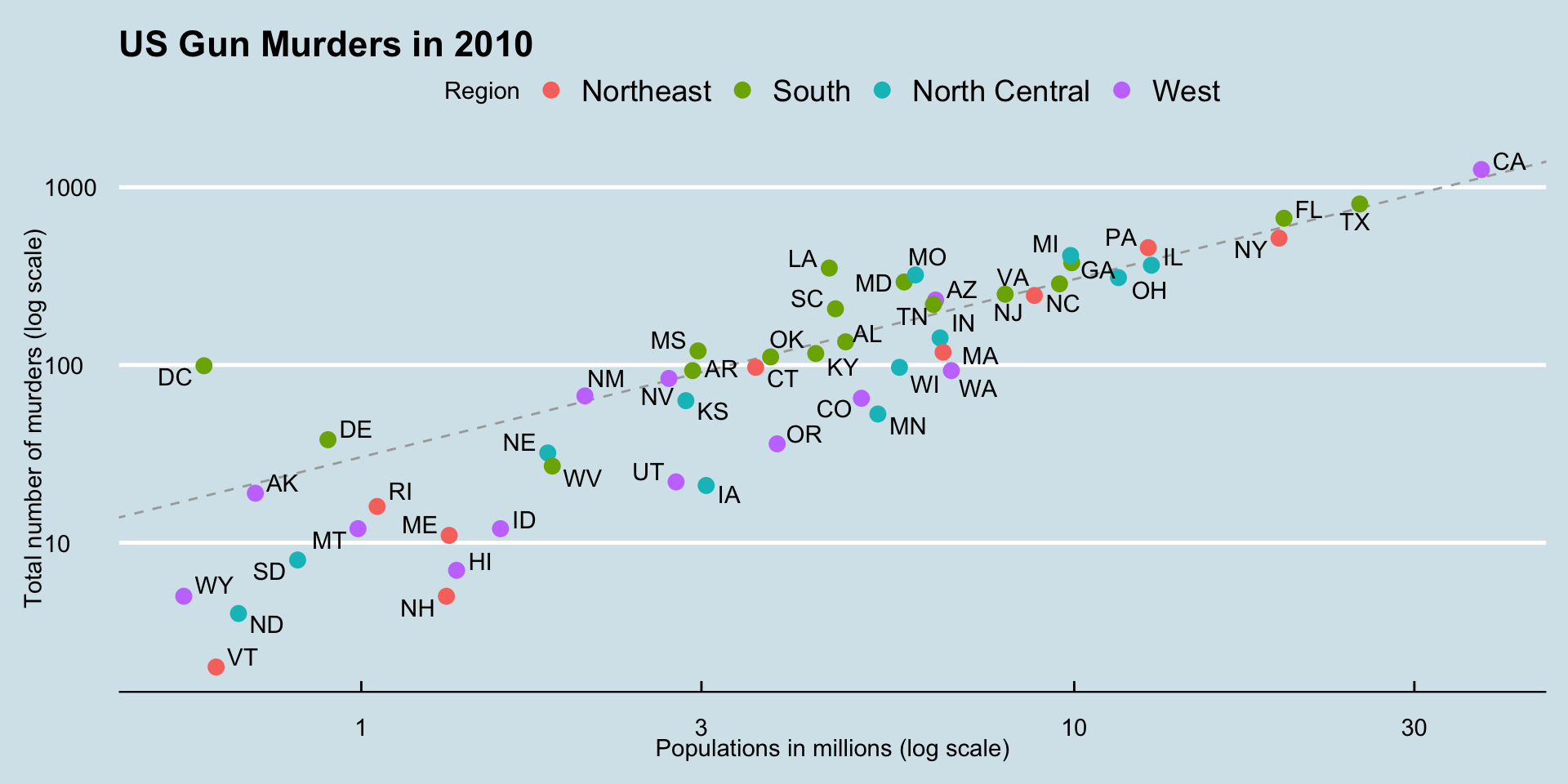
Adding color
A mapped color
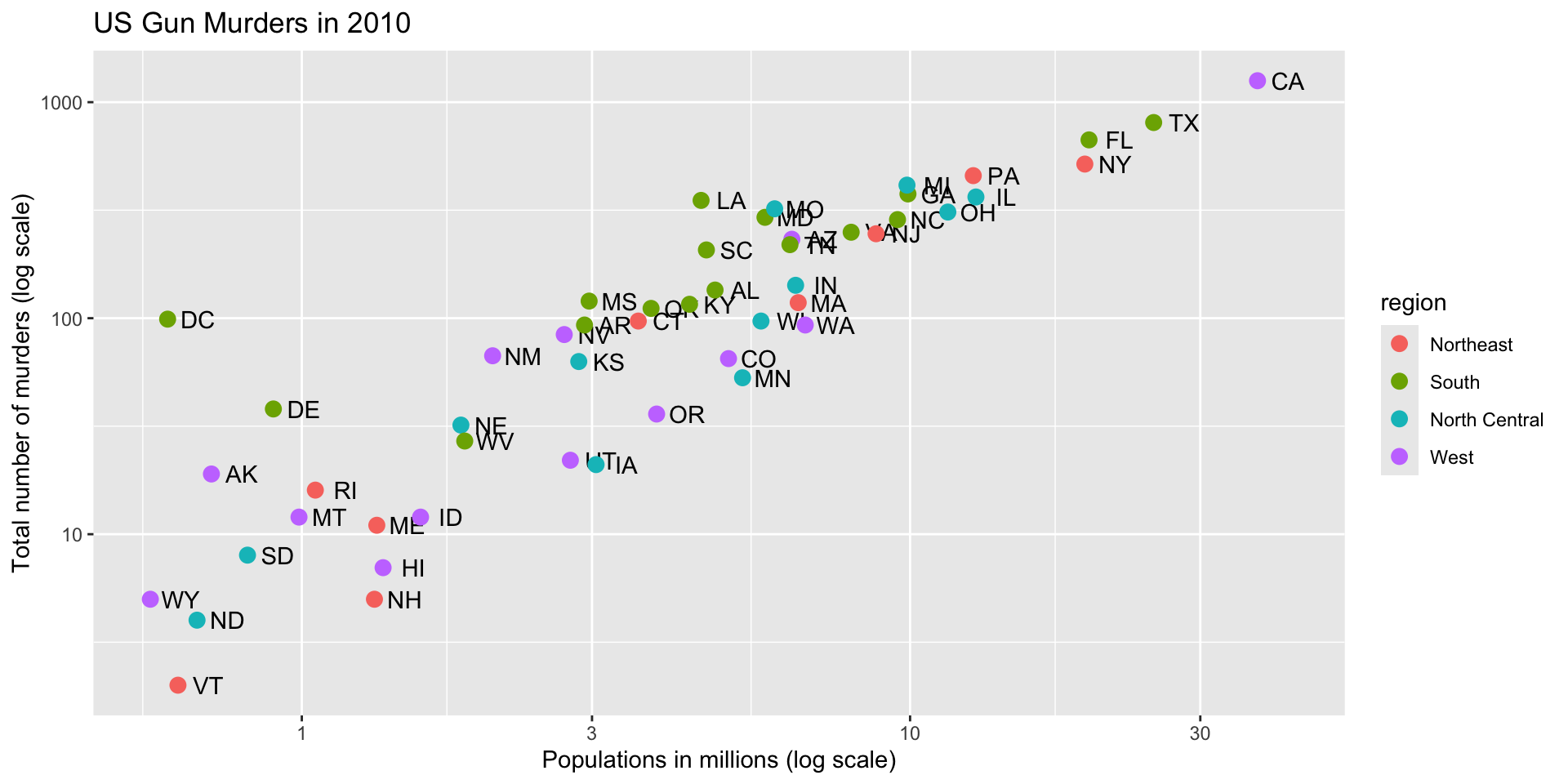
A legend is added automatically!
Change legend name
murders |> ggplot(aes(population/10^6, total, label = abb)) +
  geom_text(nudge_x = 0.05) +
  scale_x_log10() +
  scale_y_log10() +
  labs(x = "Populations in millions (log scale)",
       y = "Total number of murders (log scale)",
       title = "US Gun Murders in 2010",
       color = "Region") +
  geom_point(aes(col = region), size = 3)
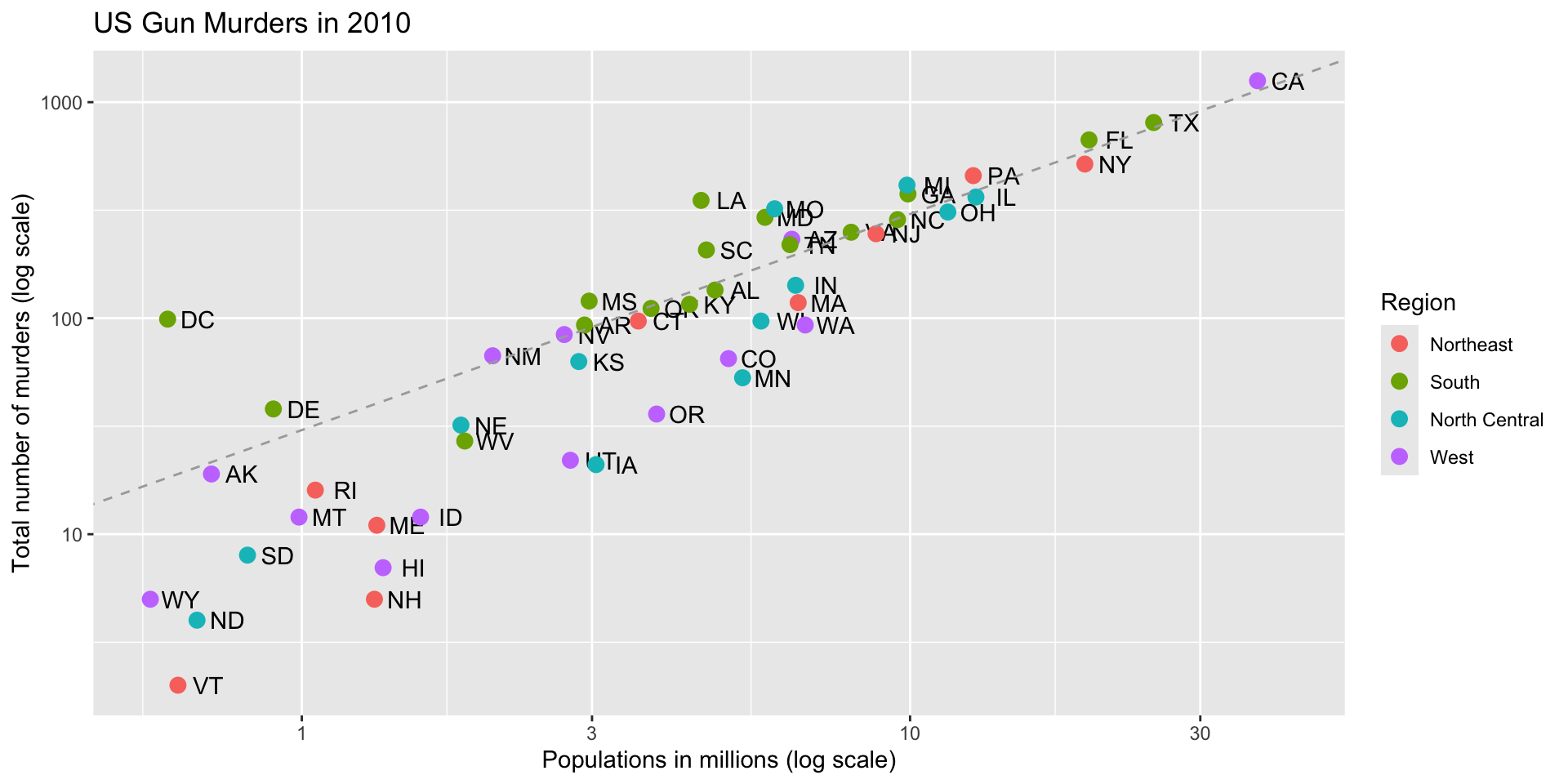
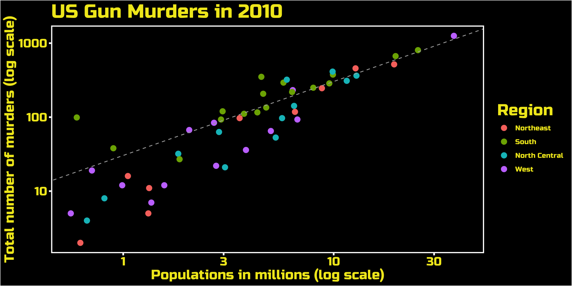
Add a line
murders |> ggplot(aes(population/10^6, total, label = abb)) +
geom_text(nudge_x = 0.05) +
scale_x_log10() +
scale_y_log10() +
labs(x = "Populations in millions (log scale)",
y = "Total number of murders (log scale)",
title = "US Gun Murders in 2010",
color = "Region") +
geom_point(aes(col = region), size = 3) +
geom_abline(intercept = log10(r), lty = 2, color = "darkgrey")
We are close!
Add-on packages
ggthemes provides pre-designed themes.
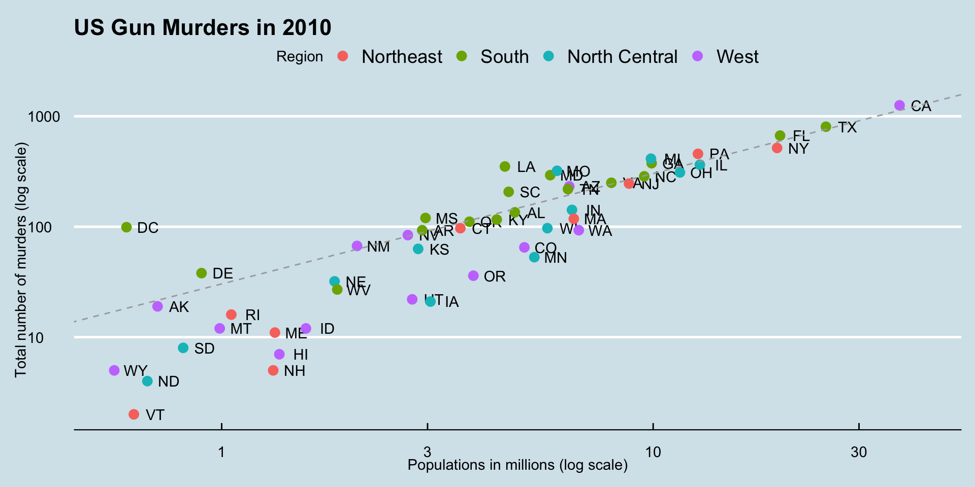
Add-on packages
Here is the FiveThirtyEight theme:

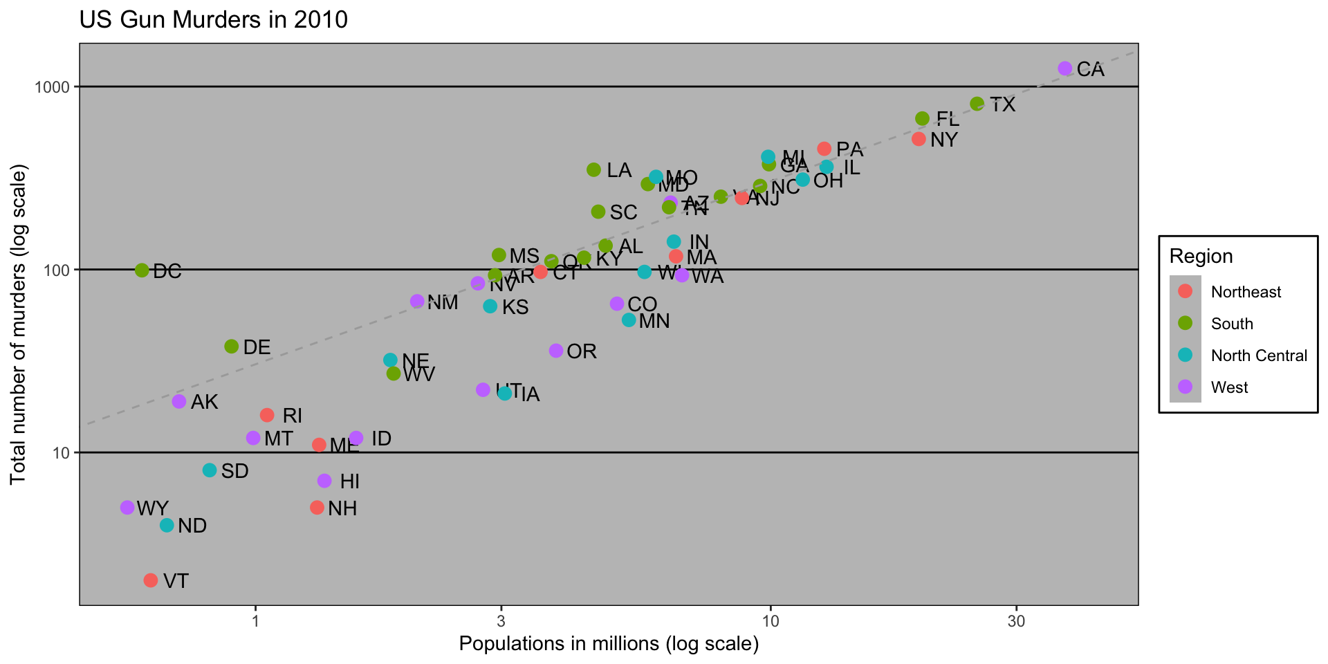
Add-on packages
If you want to ruin the plot use the excel theme:
Add-on packages
ThemePark provides fun themes:
Add-on packages
This is a fan favorite:

Putting it all together
library(ggthemes)
library(ggrepel)
r <- murders |>
  summarize(rate = sum(total) /  sum(population) * 10^6) |>
  pull(rate)
murders |> ggplot(aes(population/10^6, total, label = abb)) +
geom_abline(intercept = log10(r), lty = 2, color = "darkgrey") +
geom_point(aes(col = region), size = 3) +
geom_text_repel() +
scale_x_log10() +
scale_y_log10() +
labs(x = "Populations in millions (log scale)",
y = "Total number of murders (log scale)",
title = "US Gun Murders in 2010",
color = "Region") +
theme_economist()
Grids of plots
We often want to put plots next to each other.
The gridExtra package permits us to do that: